Comic Blog Elite

Comic Blog Elite

Thursday, May 29, 2014

Back to Pages!

...aaaand I've started slacking. I've skipped a day twice in the past 3 days. FOR SHAME! anyhoo-

Here's more of that mountain man fella, since he was last post's filler. Also, a peek at progress I'm making on a page destined to be chock-full-o-demons. This is just the framework setup. Most of the lineart for the frames is done, but there's much to do.

Also, if you've tried a zoom-in on a post I made a few days ago about reworking the tatters on the cover, you'll be pleased to see I've replaced it with a higher res photo. Blog posts via my phone seems to be limited to sending tiny images- where the thumbnail is pretty much all you get.

tried givin' him eyes. boo. killed 'em.


Attempting to make every cell divide interesting. This screams first comic, I know, but I love it- even if I'm not pleased with the dividers yet.

Tuesday, May 27, 2014

Blah

It really is disheartening posting faithfully on this blog and getting next to zero interest. Not marketing myself well, I guess. How do bozos make this shit work? No content today. Just got Manga Studio working again and have been playing in that and photoshop. Here's that poop: 

Sunday, May 25, 2014

Scrollwork

Since Tim put up a stink about text placement, there was a lot of empty parchment being all boring in the page. Don't get me wrong, the eye needs a break, but it was standing out in an unfulfilling way. Here's progress of me pkaying with a more tattered look. This is from this morning. I'm out with friends today, so there may not be much more I'll do today.
This one you can zoom in on. This should pretty much be the final cover.


Saturday, May 24, 2014

Big Cover Day

There's so much to post about from today, and I'm just not up to going into it. Forgive me... I'm shattered. 

I did lots of work on the cover today. I worked out the logo, arranged the title, adjusted colors, worn look, messed with credits, logo, etc... There's a big visual update, but it's nothing compared to the iterations. Here are pics:
I'll comment edit on these, as well as replace with higher res photos, within a few days. Same goes for yesterday's post. 

Friday, May 23, 2014

Stronger Still

This morning I added some highlights and darker darks. Mostly I darkened areas like the horns, face, and hands of both demon and dragon. I'm really pleased with how the demon fingernail claws turned out.


Thursday, May 22, 2014

Stronger Values

If you actually follow this blog, you MUST be getting sick of looking at minute cover updates. Well, bad news for you, because here's another, and there will be more. There is good news, however: I feel better, and I should have more time at might/mornings, which means wrapping up this cover shouldn't take much longer. 
Here is the cleaned up line for the ear and horn, and I'm strengthening the values of the overall piece. 

Wednesday, May 21, 2014

Ear work

Unfortunately, I felt rotten yesterday and was bedridden til this morning. I didn't get much done again: yesterday's lack of progress (though, let's face it, I still eked out a little both days) was due to the same fatigue state. I think I got in 40 minutes today. Enough to plot out the ear, try a circle framing element, and begin readjusting the base colors. Not sure how I feel about the circle. We're still sans title, so there's that also left to do. 


Also: and this is off context, I played a little with a couple fun style goofs yesterday after work. Happy I did something even though I was feeling out of it:

Tuesday, May 20, 2014

Ear Horn


When you commit to posting every single day, the content is gonna stretch in substance and quality. The fact that I only eeked in a half hour of work this morning before heading to work is a testament to that. When I was looking at the progress I've been making on the central design for the cover, I really didn't like how the central part looked like the demons shared a bloated head. I stared and stared and thought of things like just intertwined horns, but they ended up looking like pincers, and crowded the space. By accident, I happily found a good look with one ear and one horn. The horns make a nice vortex framing element for the central DVD logo. The lines are rough, as I'm finding form and that sort of thing, but I'll prettify it, hopefully tonight. Another solid night of work (a few hours), and I'm confident I'll have a finished cover. 

Don't get me wrong: I'll probably fiddle with more design. Shit, I just remembered that I need to add Demons vs Dragons to the cover... I'm thinking either a Celtic-like knotted circle surrounding the central design with those words in it, or a typical-ish scroll treatment slapped somewhere. I should do thumbnails. I'll share those when they happen.


Monday, May 19, 2014

Cover cleanup progress

I'm counting my uber early post from this morning, as yesterday's post. Lame, but there ya go. Hey! That means I still need to post today! Hope you're not sick of seeing that cover design, because here it comes again, but redone cleaner. Still a few more hours to go, but I'm pleased with the progress. Here are pics.

Quick summary of steps (I'm too tired to go into it): first couple are setting up masks, then basic values, and on with darks/lights. More of that color/value stuff to come. 


Oh No

I just realized I didn't post yesterday. I actually now can't get back to sleep knowing that... Even though very few people actually come here... Ha! Maybe I can sleep now that I'm posting, but likely I'll get up and get in a couple hours before work. Sounds nice, actually. 

Yesterday I started cleaning up the line art on the central design of the cover, and ended up starting over. Sounds kinda dumb, but it's much faster, easier, and looks better. Here are some pics from that. 
Also revealed here, is the triangular wedge/slice of the design pie. I'm mostly pleased with the progress, but a bit unhappy with the scales. I'll check out some ref today and I might actually redo that part... Yeah.

Saturday, May 17, 2014

Circles v 3.0

Wassup yo!! 

Ok that was lame. 

Good day to you, my eleven or so readers! I promised some process pics for today. Bottom circles featuring, you guessed it, a demon and a dragon.  I'm grilling at the same time I'm posting, and that's all the attention you're getting from me today. Tomorrow should show cleanup and minor changes to the central design. 

Sorry if these pics are small. I'm posting from my phone, and it seems to do that automatically. 

Friday, May 16, 2014

Taste of Process

My moronic writer can attempt to chew me out for sharing this, a pretty BIG REVEAL page, but -whatever.  There is no text in my spooky cell phone snaps of my Surface Pro screen. I need to post every single day- and the fact that it's getting late, and I did nothing last night but play poker with my girlfriend (not an innuendo), he can go bite the wall, as my loving father is so fond of saying. What follows is a series of obvious progression photos of one of our pages, along with a freeze-dried explanation of what I was doing, specifically. This might appeal to you artist types, or look like magic to people who can't draw (computers and toasters and other nonsense like that are magic to me, so don't get all fretted that I am seriously pooh-pooing (lol) people that are art stupid.), and, at the very least, serves as filler for my daily commitment to post... even if I did only get ELEVEN DAMN VIEWS today.

*groan*

Look:

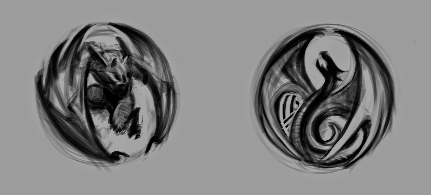
 You're going to see a change-up in the look of Dragon Fatty, who's kinda making his big appearance on this post. I met with Tim one day to loosen my methods, and I really was pushing the fun- exaggerating in a big way. This is, of course, painfully rough (see background top panel), to fairly final sketch (blue). By the way: I'm not the sort of artist who looks down on digital as some kind of fake art, even though other artists insist it's not worth their precious talent. Just because I can paste a photo and run a filter on it to make it look like something resembling art, I don't, and neither do zillions of other artists, who care about craft... so you're going to see a lot of digital, because most of the comic is done digitally. I just did rough sketches for the pages in blue pencil. WOW can I ever digress. So much for freeze-dried. 

 Here you see I've inked, and laid in a flat color. This serves me two purposes. First, the gray is a base value that I can build on. Secondly, it's its own layer, and serves as a mask-able thing. I can limit my shading to that area. I won't go into detail on masks, because I'm not doing a full-on how-to-do-art blog. This is just general method stuff. I have more of that coming in future posts, so don't be a jerk... check back often!

Using that gray base/mask, I made a couple more clean layers. 

This is just more of the same. Mid-range values, darks, and lights all masked and ready to spiff.

Now I've gone in and done some air-brushy stuff, as well as some semi-crisp strokes (dark pencil in Manga Studio). I even started to goop in the background.

Like I said, I'll not get too specific today, but basically here I've added a new layer for hatch-like strokes (something of a style I'm developing), then mess with their alphas to make them fade all pretty... You an see on Fatty's pauldron, that I did a soft air-brushy on a new top-most layer.

I've also used the ink layer to create yet another masked layer, which goes on top- and now I can give more light fun to an otherwise flat ink. I tweak here and there, but that's generally it. Here's the whole page for your pleasure or disgust. Text-free, like I said. That comes free with the comic, if/when it's finished and you buy it or someone gives it to you.

Thursday, May 15, 2014

Circles v. 2.0

Alrighty- Here's a superfast post... no time to get into it- lunchtime is over, yo. Last night I got more work done. What follows is the implementation of the first two circle fillers, and the sketch for the final (bottom) two... a demon and a dragon. Does that surprise you? Shut up, it does not.


Yeah, went a bit heavy on the grunge. That's just a mask. I'll tweak later.

NEXT!